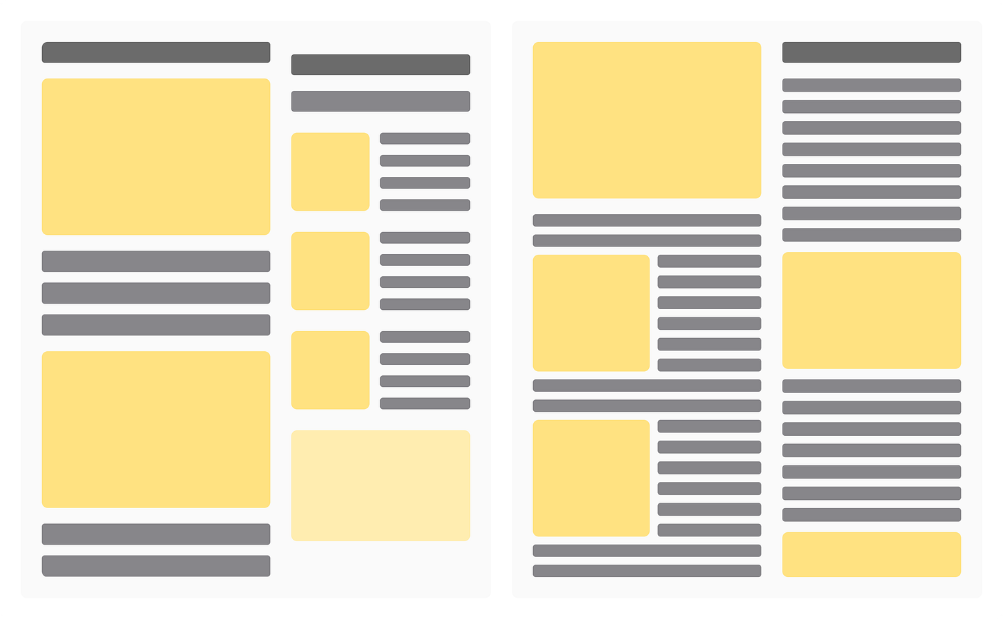
Make Your Website Readable and Awesome!
Ever land on a website and bounce right off 'cause you couldn’t read a thing?
In today’s digital world, your website is often the first impression. You want that to be a killer one, right? Let’s nail this!
What’s the Big Deal?
If your site’s readability sucks, people leave. Simple as that. Hard-to-read sites mean higher bounce rates and missed opportunities.
The Culprits:
Jargon overload, huge blocks of text, tiny fonts, and crappy contrast are just a few of the killers.
The Usual Advice (And Why It’s Meh)
More content is king!” But in reality, more content is useless if it’s hard to read. Even the best info gets ignored if it’s not presented clearly.
The Game Plan
Make your content easy to read and engaging.
Step 1: Keep It Simple
Write like you’re chatting with an 8th grader. Dump the jargon and complicated words.
Pro Tips: Swap "utilize" with "use" and "commence" with "start." Easy, right?
Step 2: Break It Down
Use short sentences and paragraphs. Spice it up with headings, bullet points, and numbered lists.
Golden Rule: One idea per paragraph. Lists are your new best friend.
Step 3: Design for the Eyes
Pick fonts that are easy to read and big enough to see. High contrast is key.
Avoid This: No decorative fonts or clashing colors. Stick to clean and simple.
Start now and watch your website become a magnet for visitors.
Final Thoughts
Focus on readability, and you’ll keep visitors around longer. It’s all about that sweet user experience.
Big Win: Clear content = professional look + audience trust.
Need Help?
Want expert advice on making your site more readable?
Investing in readability can skyrocket engagement and conversions.
Let’s Discuss
What’s the worst website you’ve tried to read? Spill the tea in the comments! ☕
We love hearing your thoughts on readability. Share your wins and struggles!


